

Table of Contents
Every human being is different and uses digital products in completely different ways.
But the interfaces are usually not adjusted for people with disabilities. Having in mind the challenges that they have to face on a daily basis, we can equalize the chances and improve the user experiences in general.
Why Accessibility Matters
For designers, it’s really important to understand that having disability impacts the way you interact with certain devices. We are used to standards and practices that do not contemplate those differences.
People with disabilities represent a large demographic. Ensuring your product is accessible should be at the top of your list.
Are you sure your web products are accessible?
We can evaluate and improve web accessibility in your projects.
Contact usInterface
Let’s start with a simple definition: What is an interface?
In general, it’s a software or a device allowing users to communicate with computers. It’s a space where humans can interact with a machine.
Common tools that we use for such communications are keyboards, mouses, smartphone displays, or even microphones.
Assistive Technology
Assistive technology (AT) is a set of tools and software that help such users become more independent and gain the possibility to communicate and navigate with interfaces.
Types of Disabilities
1. Sight
According to data shared by the World Health Organisation, at least 25% of the population lives with some kind of sight disability. It reveals to us the huge amount of almost two billion human beings worldwide.
The vast majority of that group is above the age of 50, but, as time flies, the percentage of young people increases.
The most popular AT used by such users are screen readers, which can analyze the content shown on the screen and convert it into speech. Voice commands allow them to take control of the playback speed of the audio to more easily navigate through the webpage.
Other commonly used tools are screen magnifiers, very helpful for those visually impaired, and braille displays or keyboards for blind people.
Source: World Health Organisation Factsheets, 08.10.2020
Color Blindness
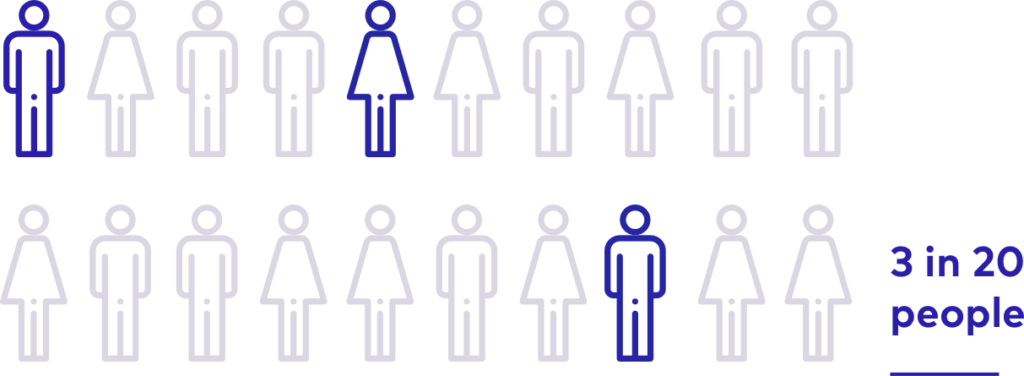
It is estimated that around 8% of men and 1% of women are color blind. The term is misleading because more than 99% of all colorblind people can see color. They just see it a bit differently.
There are several different types of color blindness, each of them causes problems with seeing different colors.
Red-green color blindness
The most common type of color blindness makes it hard to differentiate between red and green.
There are 4 types of red-green color blindness:
- Deuteranomaly – the most common type of red-green color blindness. It makes green look redder.
- Protanomaly – makes red look more green and less bright.
- Protanopia and deuteranopia both make it impossible to tell the difference between red and green at all.
Blue-yellow color blindness
This less-common type of color blindness makes it hard to distinguish between blue and green, and between yellow and red.
There are 2 types of blue-yellow color blindness:
- Tritanomaly – blurs the difference between blue and green, and between yellow and red.
- Tritanopia – makes you unable to discern between blue and green, purple and red, and yellow and pink. It also makes colors look less bright.
Complete color blindness
If you have complete color blindness, you can’t see colors at all. This is also called monochromacy, and it’s quite uncommon. Depending on the type, you may also have trouble seeing clearly and you may be more sensitive to light.
| Type | Prevalence |
| Deuteranomaly (green) | 4.63% |
| Deuteranopia (green) | 1.27% |
| Protanomaly (red) | 1.08% |
| Protanopia (red) | 1.01% |
| Tritanomaly (blue) | 0.02% |
| Tritanopia (blue) | 0.03% |
2. Deafness and Hearing Loss
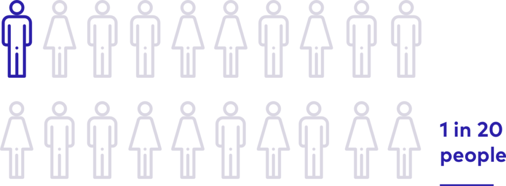
According to WHO, more than 5% of the population have disabling hearing loss, meaning it somehow impairs their normal functioning. It is estimated that by 2050 over 900 million people – or one in every ten people – will have disabling hearing loss.
The most helpful functionalities on the internet for such users are visual alternatives to strictly sound-based files. Examples are captions, sign language translations, or additional visual or movement-based notifications.
3. Motor Disabilities
Another numerous group is that of people with motor disability – partial or total loss of function of a body part, usually a limb or limbs.
Motor impairment is often evident in neurological conditions such a cerebral palsy, Parkinson’s disease, stroke, and multiple sclerosis.
On a daily basis, users with motor impairment operate without using a mouse (only keyboard). Sometimes, using only the head together with additional assistive technology, such as eye-tracking devices or voice recognition software.
4. Cognitive Disability
Cognitive disability, also known as intellectual disability, is a wide term describing a person who has greater difficulty with mental tasks than the average person. It is by far the most common type of disability.
The most common tools used by people with cognitive disabilities are screen readers or text-to-speech technology. They often use custom font families and styles or different page colors.
To help users focus on important content and functionality, avoid distractions, use good design, such as color, white space, and simple presentation. It is also important to write the page content as simple to understand as possible.
WCAG
Web Content Accessibility Guidelines (WCAG), currently 2.1, is a huge set of rules & recommendations for creating websites and applications, When applied, these instructions help people with disabilities browse content by making it more accessible to all users.
Those rules were arranged within the POUR rules, an acronym for:
- Perceivable
- Operable
- Understandable
- Robust
For each of those guidelines, there are testable success criteria, which are at three levels: A, AA, and AAA.
- A – minimum level of conformance
- AA – recommended level
- AAA – full conformance
The list of those recommendations is really long, but in the next paragraphs, I will do my best to summarize what are the most important practices for designers to create an accessible web.
Practical Web Accessibility Tips
Including the WCAG rules in the early stage of the design process allows to effectively adjust the components to accessibility standards without drastic costs increase.
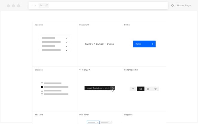
It is very helpful to use these design systems, even for the most basic sites.
They help us to create consistent interfaces and scale the design decisions from the smallest components to the whole system.
In my experience as a designer, I learned that it is a practice that significantly speeds up the design process and makes it way easier.
Always validate your design choices as early in the process as possible.
Contrast
It is very important to keep a suitable contrast on the website or application.
According to the WCAG, the color ratio for big elements should be at least 4.5:1 and for smaller, standard elements at least 7:1.
That ratio can be easily checked with menu tools, both in the design process and in the final product version.
There are some exceptions in that rule – some interface elements, such as disabled state for interactive elements, don’t have to be kept in the presented ratio.
Additional Visual Differences
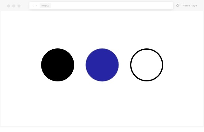
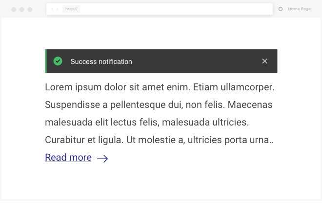
While distinguishing particular actions or interface elements, do not limit yourself to color only. It is important to use alternatives, such as additional text within the form inputs, icons, or shapes. That will help the color-blind users to easily understand the interface key functionalities.
Elements such as charts or diagrams should not use only colors to distinguish elements. It is also essential to use different visual distinctions for the data.
Interface Consistency
All users need consistency in the interfaces, but, some users depend on them to properly achieve what the interface intends.
Do not reinvent the wheel for new functionalities, use your previously made decisions, to keep the flow understandable and predictable.
Designing the components with the whole interface in mind should help with that.
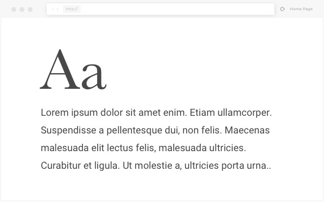
Content Readability
Remember to keep the text size at least 16px and the line height at least 1.5 bigger than the font size.
Avoid justification, which makes the content harder to read.
Some of the font weights might be also problematic. Avoid light text weights, especially with small texts. Keep the content simple and understandable.
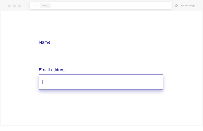
Focus & Tab Order
Focus state represents the currently chosen element (i.e. text field, button, link, etc.).
During the design process, remember to think about all the components’ states, including the focus state. The Tab key allows users to navigate between those interactive elements. It is also an important matter for the screen readers.
Remember to keep your links copy descriptive and informative. Avoid using “Click here” links.
Headings & Layout
Screen readers users often use headlines to navigate through the websites they don’t know. They look for headers such as h2 and h3 and, this way, they can easily jump between sections.
So it is important to keep the structure of the webpage understandable.
In the design process, remember about the hierarchy of headings and design a complete type style guide and use it consistently.
Responsiveness
Website designs should be fully responsive and include several breakpoints variants. Remember about the mobile and tablet alternatives.
When the user magnifies the screen, the content should be still readable and information should not get lost.
Text Alternatives (Alt attribute)
All images should contain their own alternative text, which may be read by assistive technology or displayed when the image file does not load properly.
It is also important to use text alternatives for interactive elements, strictly visual, i.e. standalone action icons.
With that in mind, you will allow the screen reader users to understand your navigation. Remember to keep the content of those alternatives as descriptive as possible.
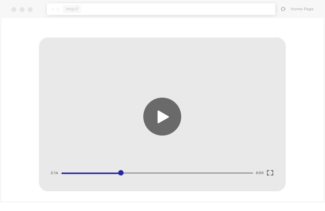
Multimedia
Multimedia content, such as video files, should also contain the text alternative – captions or sign language translation.
Thanks to that, you will help not only people with hearing loss or deafness, but also users with temporary disability, like loud surroundings.
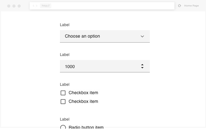
Forms Readability
To make sure your forms are easy to navigate, remember about maintaining field consistency and different states.
Keep the form layout and structure easy to read – in most cases, vertical, the single-column layout works the best.
Remember about fields` labels and placeholders to help users successfully finish the form task.
Regarding the warnings and form feedback – as mentioned in other paragraphs, do not limit your visual communication to color only. Use icons and descriptive error texts.
Animations and Interactions
Yes, animations are sexy, but use them wisely. Keep it short and moderate. Avoid using too intensive flash animations, which could trigger potential epileptic seizures or motion sickness.
Parallax animations are also fine, but not in excess.
Helpful Tools to Improve Accessibility in Web Interfaces
There many different tools available that might help you design with accessibility in mind.
- Design software plugins:
- Online contrast checkers
- WAVE Web Accessibility Evaluation Tool – website accessibility analyzer
- Accessible Metrics – another website analyzer